
The Nashville Predators have one of the worst uniforms in all of sports. The Stadium Series Jersey is terrible, the absolute worst. The jerseys look like someone just created them on Microsoft Word, and they lack creativity overall with how basic it is. If this were a t-shirt, it would stay on the racks until it was repriced for a half-price sale, and it may still not sell.
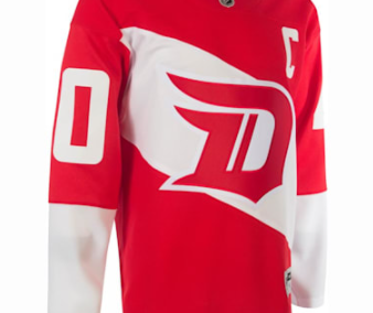
The Preds don’t even bother trying anymore; there’s no effort put into making their apparel for this design. At least the Dallas stadium series jersey was interesting. However, the new blue jersey with “Smashville” is lame. It is the worst, making it worse than the Detroit Stadium Series jersey with the D on it.
If it’s still possible to make changes, please do Nashville. You will look back on this and be embarrassed. This also sets a low bar for other teams’ who make similar attire which makes us wonder why anyone would want anything so boring?
Its not just us who think this is UGLY. Seriously, whoever was in the “creative department” may want to go back to accounting. Check out what other fans think:

— Mike Pfeil (@mikeFAIL) December 2, 2021

Have you ever seen this 49ers helmet before? It never hit the field because 49ers fans hated it so much that they decided against using it. It’s not too late to do the same thing with these jerseys. 🚮 pic.twitter.com/v6urQUD2oe
— Hamp Hickman (@HampHickman) December 3, 2021
Nashville Predators make worst uniforms in hockey
Nashville Stadium Series Jersey is terrible, the absolute worst. The jerseys look like someone just created them on Microsoft Word…https://t.co/29bbRclujU#ugliest #NHL #BAD #Jersey #FixItNow #Predators #stadiumseries pic.twitter.com/9EqkwksLlf
— American-Review.org (@org_review) December 6, 2021